Overview
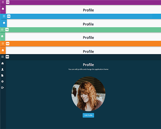
The Theme Selector connector module enables Mendix developers to easily incorporate dark and light theme selections in their applications. The light theme includes four sub-themes (purple, orange, blue, and green) that can be easily customized to fit any brand or application.
This connector module also allows for theme selection to be associated with Mendix accounts, providing a personalized experience for end-users. With its simple integration and easy-to-use interface, the Theme Selector module is the perfect addition to any Mendix project looking to enhance its user experience.
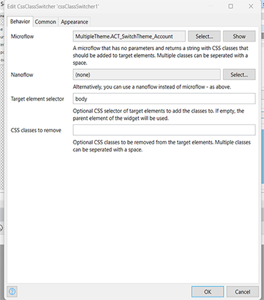
Inspired by CSS Class Switcher
Documentation

Description
The Theme Selector connector module enables Mendix developers to easily incorporate dark and light theme selections in their applications. The light theme includes four sub-themes (purple, orange, blue, and green) that can be easily customized to fit any brand or application.
This connector module also allows for theme selection to be associated with Mendix accounts, providing a personalized experience for end-users. With its simple integration and easy-to-use interface, the Theme Selector module is the perfect addition to any Mendix project looking to enhance its user experience.
Inspired by CSS Class Switcher
Pre-requisite
- CSS Class Switcher widget
- Mendix 9.12.4
Installation
- Import the module into your application.
- Do synchronize your project directory.
- Navigate to project settings and click on the theme tab, move the MultipleTheme module to the top.
- Configure the project security.In project navigation call the home page 'MultipleTheme.Show_HomePage'.
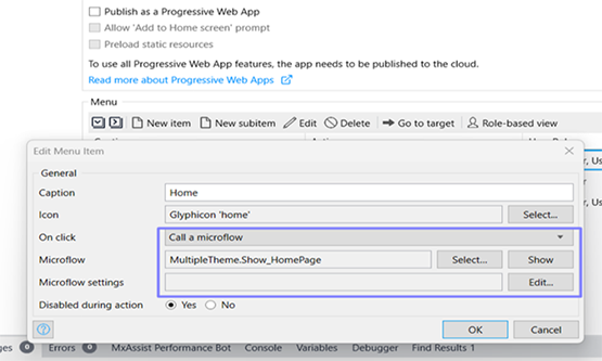
- In navigation, change the default home page to 'MultipleTheme.Show_HomePage'
- Add an account overview page on the project navigation.
- Run the application.
- Navigate to account overview and create new users.
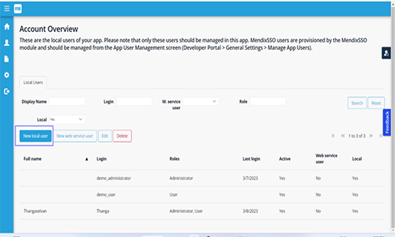
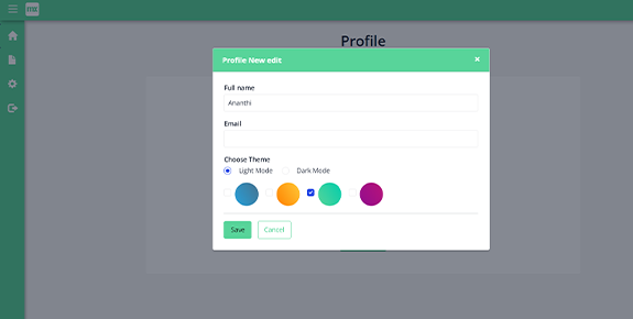
- Navigate to the home page and click on the edit profile icon.
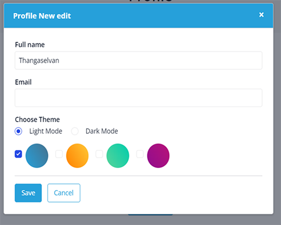
- In the edit profile page you can customize the theme based on your wish.
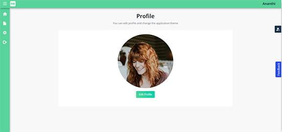
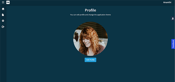
Screenshots
